1. Flathub
I don’t understand what is purpose of “Flathub”? If I click on particular flatpak nothing happens. Is this something new that is not finished yet or I don’t understand how does it work?
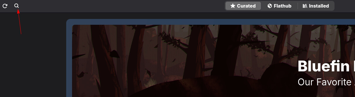
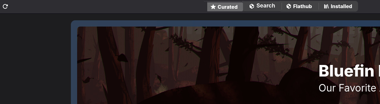
2. Search button
Room of improvement is “Search” button. It looks like this before clicking on search button:
But looks like this when search button is clicked:
Why did middle buttons disappeared? It looks like something is broken when search button is clicked. What about this design, to have “Search” as button:
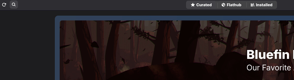
or at least this one (search button enabled and middle buttons still displayed).
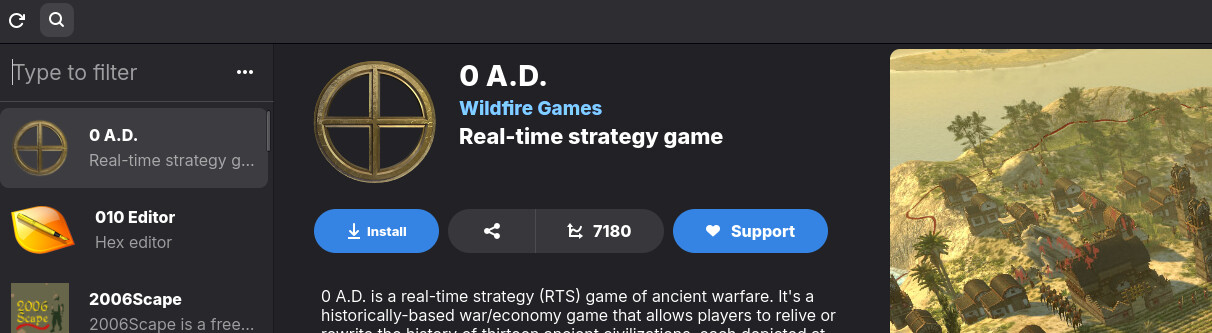
3. Installed apps
Installed app list is displayed like this:
There are plenty of apps in Installed list, some that are installed by default, some I have maybe installed, but forgot what is it for. Clicking on installed app icon and nothing happens. It would be nice to have some bubble inflated and more info displayed about what this app is that is installed. Now I click on Search button at top left and search for it to see what is it for.
When mouse is moved and waited on icons “three” dots tip is displayed, but no tip for first two icons. I expect to get “Play” and “Delete” tips.
4. Transaction
When app is installed in title there is still “Updating” indicating installation is in progress. Also at bottom there is Pause button when clicked it changes to Play button, but I don’t think this buttons should work. If app is installed then pause button should be greyed out or probably better to disappear, the same with Stop button. No need to be displayed if it has no function.
I am also not a big fan of having three dots at text like at “org.gnome.Pa…” or “Finished in 6,69 seco…” The later would probably be better to be displayed in two rows, specially when translations appears and text may get larger.
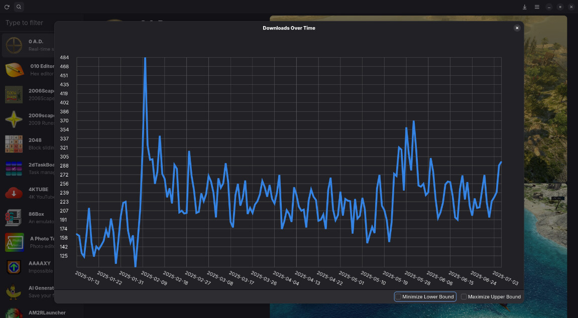
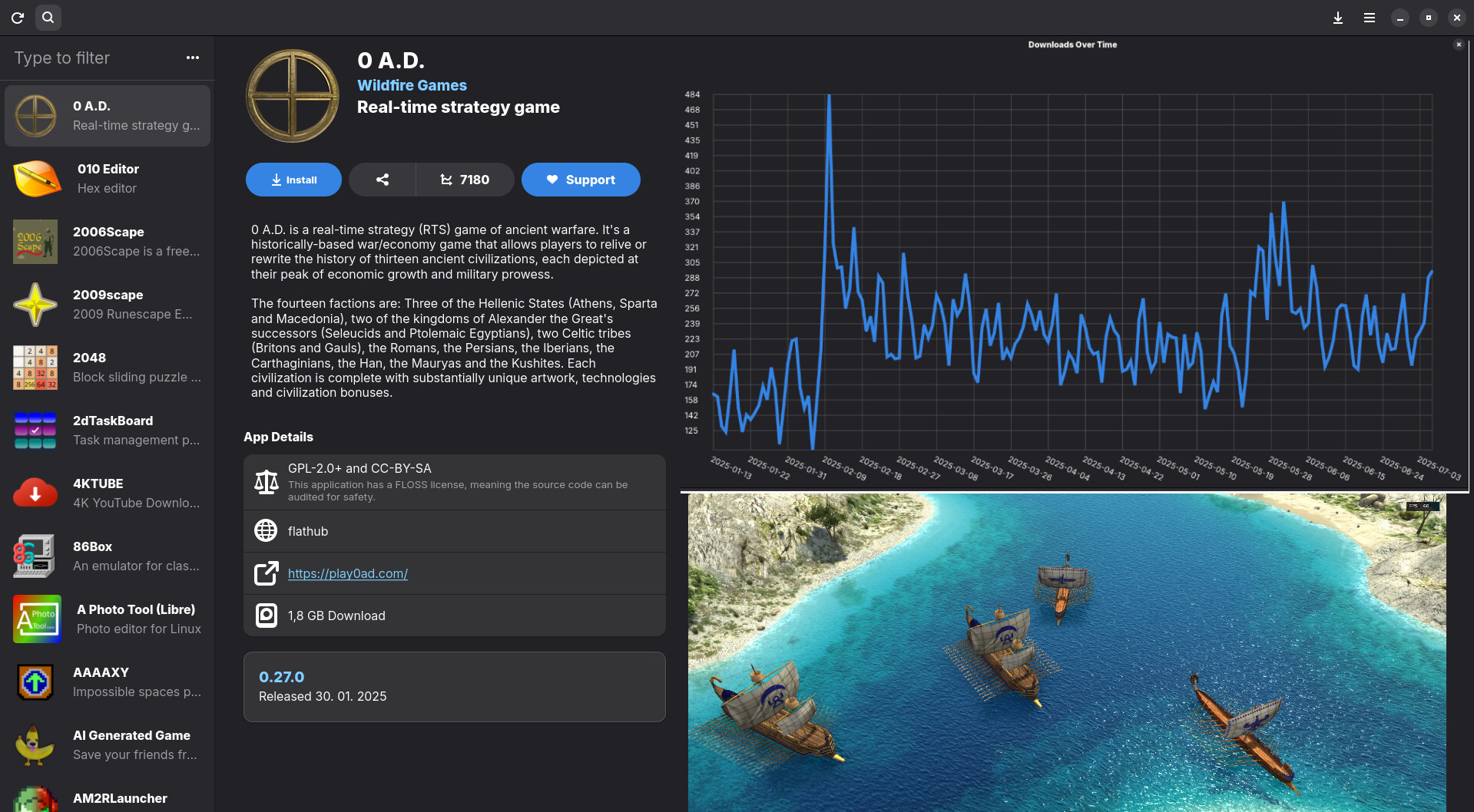
5. Number of downloads
When graph is displayed, clicking anywhere should just close down the graph, no need to get to the top-right to close down. Also two options on button I don’t really see big reason to have it, it would be better without them, simplicity.
I also think it would be better graph to be displayed at top-right at the place of first picture (and first picture moved down to second place), something like this.
6. Similar apps
What I would like to see when I click on one app and details are displayed, to display similar apps like alternatives. For example if I click on Firefox, I would like to get other browser as suggestion to install as alternative. Something like (see bottom):